
Introduction
Hallo! It’s a me, Mario Linh, back with another make-it-with-me project walkthrough. This time it’s a construction hoarding project!
We’re diving straight in here. First, I applied for a call from the Mississauga Arts Council x HATCH x Region of Peel for hoarding artwork to live in Streetsville during a sad multi-year stretch of planned construction (water infrastructure stuff if I remember correctly). They ask that the artwork be inspired by iconic Canadian landscape artists, and that it includes nature and Ontario wildlife. The nature bit is what made me choose to apply to this instead of other hoarding calls because it fit my work best, and I would have my best chance here.
proposal
I started my application late (as per usual 😬) and didn’t have a ton of time. The call asked for 3 concepts, which is quite a lot for a single-stage call, so I decided to rework past project proposals that 1. I like and want to work on and 2. fit the brief/could be adapted to better fit the brief. It is important to me (and the project) that the work I make is actually site-specific.


I pulled a bunch of old proposals and reference image collections I’ve previously made. I often draw from Ontario’s wildlife, particularly at-risk species so there were many appropriate choices available. Once I narrowed the options down, I double checked that animal/plant species choices were appropriate for this location.
At this point, I also thought that we were proposing 3 concepts for 1 to be chosen. This assumption turns out to be wrong, lol but future me will deal with that.
Proposal-writing me chose 3 artworks by Canadian landscape artists as inspiration. As you can see below, I presented the inspo artworks along with reasons why I chose them, and paired them with artworks of my own that mirrored the elements I wanted to emulate in this hoarding project.

Simplied: smushy, digital/traditional mediums combo and inclusion of Ontario wildlife, and maybe some patterns.
Here are the sketches as they were in previous proposals, and then how they were presented in this new proposal (with description, reference pictures and potential colour palette)


project accepted
It was at this time that I learned I had to make all three designs 😅 Yikes, time to get on it! (☉__☉”)
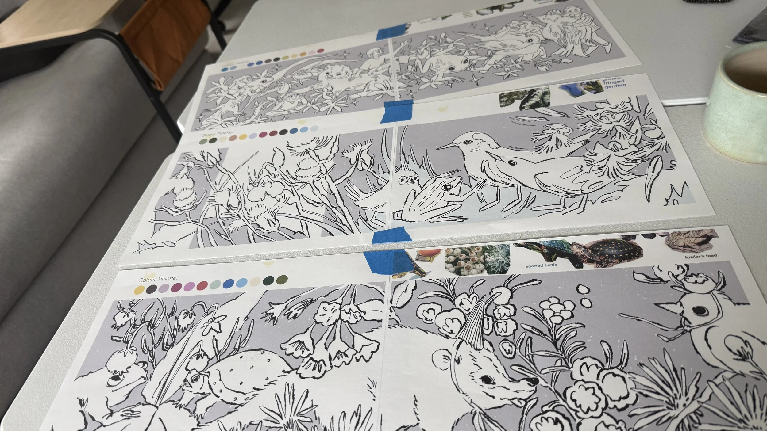
I printed out each sketch on 2 pages and stuck them together. These will act as my templates for painting. Modifications to the designs were made so that there were no duplicate animals. I fiddled with the colour palettes so that there were duplicate colours across 2 or 3 of the designs for cohesion, and cut a few colours to make it easier for painting.
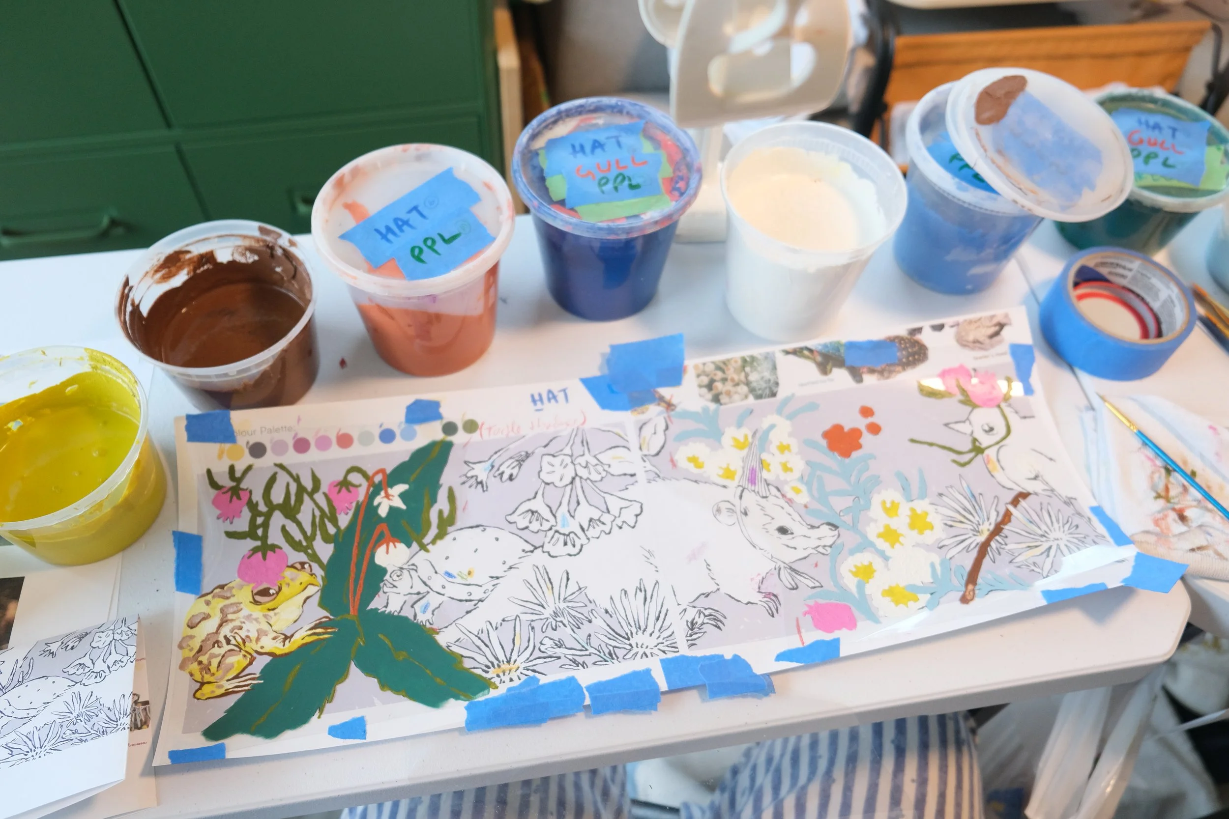
For sustainability and for budget’s sake, I try to use up my paint supply as much as possible before purchasing new materials. For this project I only used paper/excess paints from past projects. I marked what colours I wanted to use on each sketch, and labelled my paint tubs to match. The flat colours are regular exterior latex paints, and the paints with grit in them are from ground murals that have anti-slip something mixed in.
3 pieces of duralar were laid over each sketch, so that each duralar section could be small enough to fit in my scanner once I’m done painting.
Then, it was just a slow slog of follow the template, refer back to real images, and paint everything in.
Here’s a 50min compilation of the work in progress, some timelapses and some real time footage set to some instrumental+/classical music. You can play it in the background and pretend I’m your studio time buddy ٩>ᴗ<)و
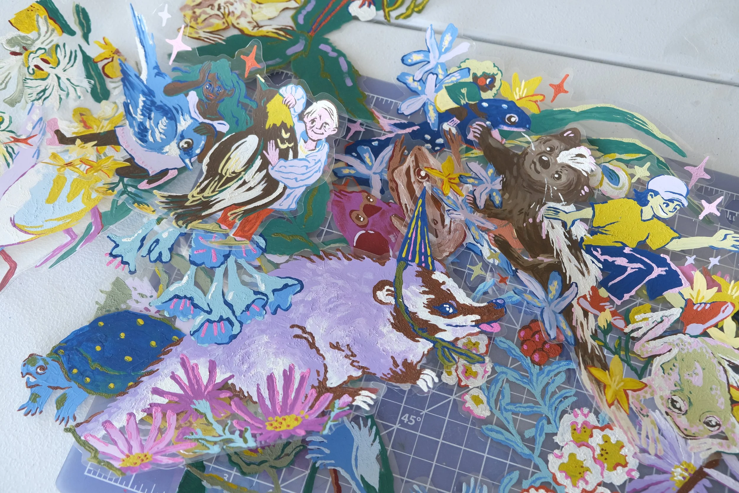
Digitizing time —Problems galore
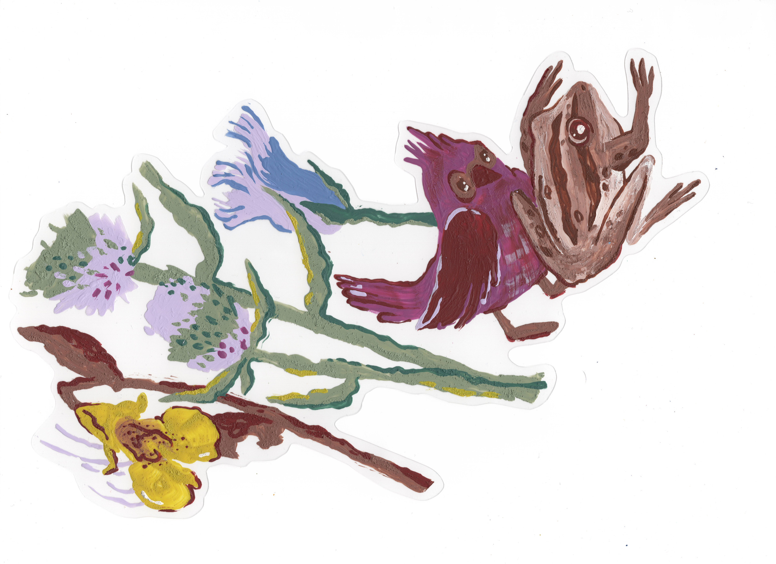
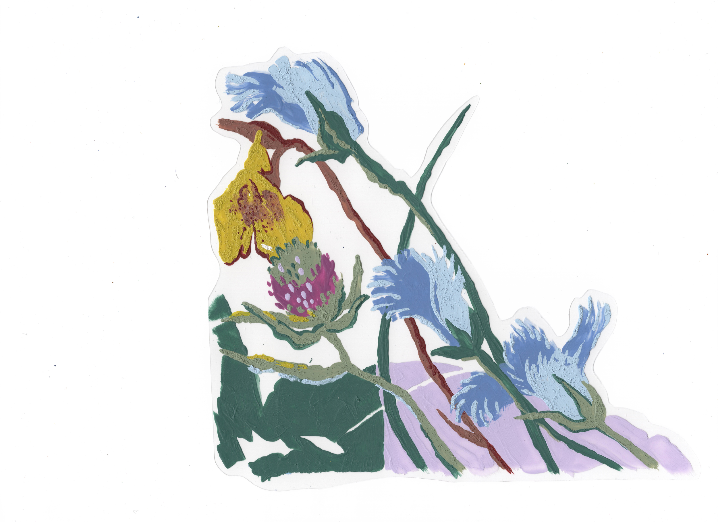
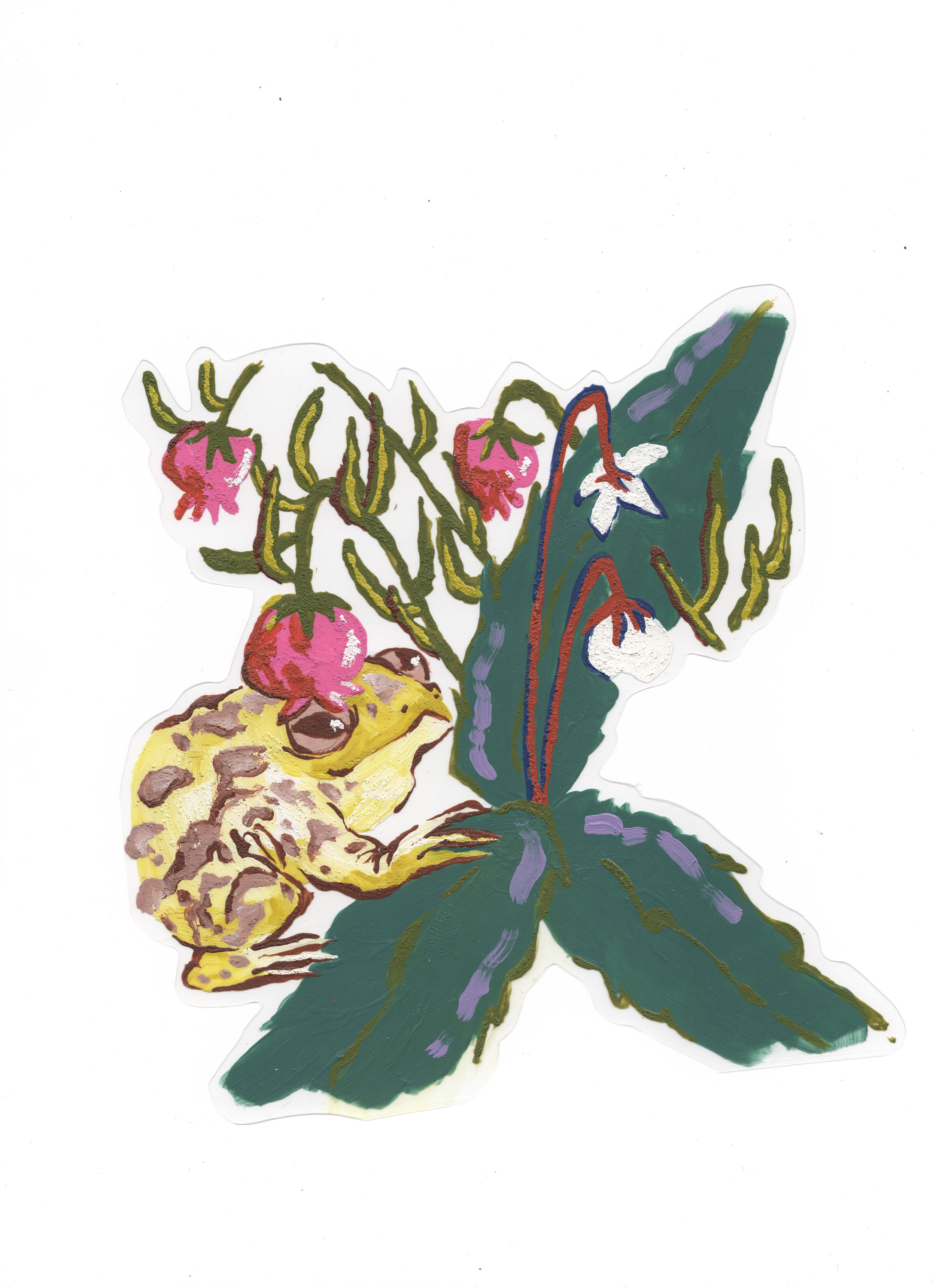
Foreground stuff done, now all the duralar gets a wipe down and scanned in at high res. It looks like this:

Then came dealing with the digital parts, which I hadn’t thought out all that much beforehand apart from knowing that I wanted to do the background and some of the detailing/textures digitally.
At first I tried to remove the background whites, but it was too finicky and I couldn’t select the parts I wanted cleanly. (ᵕ—ᴗ—) My paint also had whites in it, in addition to frayed textured edges which made it hard to separate out.
In the end I went with setting the layer mode to multiply which essentially makes the whites invisible, but the coloured portions also become translucent —layers above/below are visible). I manually selected/edited tiny portions where the paint layers overlapped incorrectly to put on top as an opaque layer.

Resizing scanned artwork to match original composition
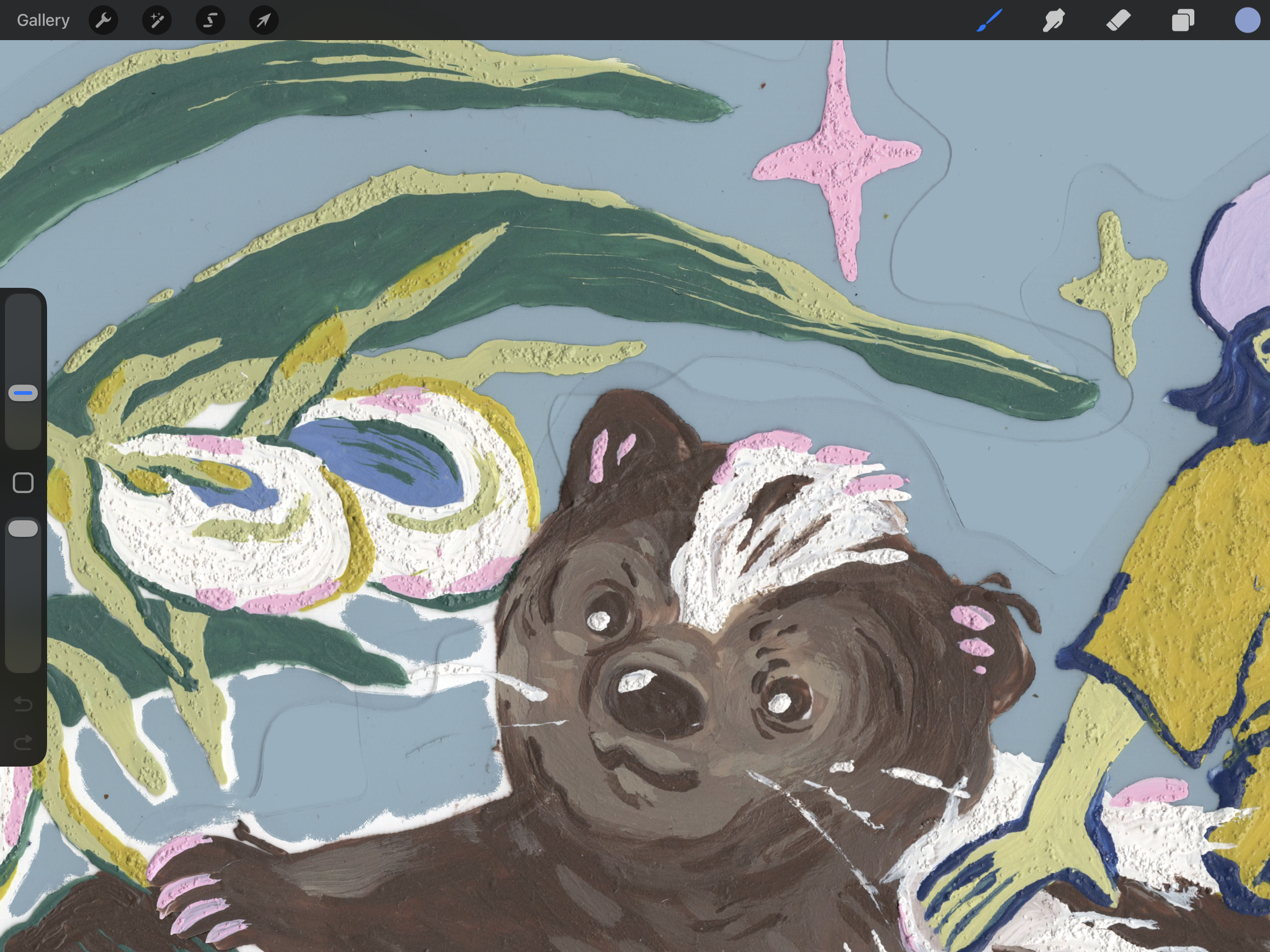
Once everything was resized properly, I exported my Illustrator files and brought them into Procreate to draw. Resizing things in Procreate always makes the resolution go to potato quality so I avoid it as much as possible.

I selected a few brushes to use for all three pieces, some gritty line brushes and some for bigger, grainy textures. I love the Monomania brush set from True Grit Texture Supply, and I think I pulled one or two from Procreate’s new brush galleries.
Backgrounds are kept simple since there’s so much going on in the foreground already. Colour blocks with textures is what I gravitate towards. Colours are colour picked from my paintings, and adjusted to suit each piece.
I want the artworks to feel like they belong together, but I didn’t want them to be too same samey. Hat’s All Folks got grass hills, Hand in Paw in Wing in Hand got a solid background with decorative plants mimicking The Wisdom of the Universe, and I kept the rectangular colour blocking from Group Chat’s original composition.
The clear duralar edges were preserved!
I fussed with the settings and selection tools here too but couldn’t figure out a better solution. That meant sticking with multiply and painstakingly colour in the white background right up to meet the painted edges instead of being able to colour behind the paint.
After a few extra flourishes and sparingly used glitch effects, it was time to bring the files back over to Illustrator for final touches. To unify the foreground painted layers and the digitally illustrated components, and for a bit more texture, I add a texture overlay. I tested out a bunch:

Looking at my top texture overlay options
At first I thought each piece would have a different texture that suited them, but in the end chose the same one for all three for more cohesion across the series. Plus the one I ended up choosing had both a pulpy, flecked paper texture that I like, and a bit of a wash of colour that added a little more dimension that worked for all three pieces.
presentation/edit time
MAC required that each artist across multiple of their hoarding projects to present work in progress (although I finished mine, hoping that I’d blow them away and be more convincing. Among other reasons, I did not want to do lots of editing because of how tedious and new this combo of paint/digital was for me). I did a short process show and tell, kind of like this blog in a meeting with project stakeholders — MAC, Region of Peel, HATCH, and Councillor Brad Butt.
Feedback/edits I received included: open the bird beak(s) in Group Chat so it looks more like a conversation, and to make the backgrounds bolder so that the artwork pops more.
New bird beaks
For the beaks I laid another piece of duralar on top to paint the beaks and then scanned it and added it on top. As for the backgrounds, I was more hesitant as I like soft colours and a lot of what I tried overwhelmed the paintings. In the end I tweaked colours only a little bit, but did bump up the saturation and contrast.
At the time of writing this, it is june 9, 2026
I submitted my edits two weeks ago now, and am waiting for approval/notes for one more round of revisions. If all is good, I send off the artwork at print-ready size and then I’ll see it installed sometime later this year.
🪄✨✨
This combo of paint/digital has been on my mind for a long time. I’m glad there’s finally a project that I can try this out on. I’m pleased with how it turned out and hopefully for future iterations the process will be a little smoother/quicker.
And (t)hat’s all folks, thanks for reading! If you’re in Streetsville, Mississauga, I hope you find the artwork when it’s up :) Documentation will make it to my instagram and website eventually
my fav composition, don’t tell the others (˵ ¬ᴗ¬˵)
( っ˶´ ˘ `)っ
Linh