

Original post from: February 9, 2022 Hi friends! ヽ(〃∀〃)ノ
I try to document a lot of stuff during my projects; sketchbook scribbles, multiple versions of the digital design, and plenty of pictures/videos of the process. A bunch of it I share over on my instagram, but there’s lots more. For many reasons, I’ve been thinking of trying something new so long story short… here’s my first blog post! I want to keep this casual so we’ll see how this goes.
Today, I thought I would share some behind the scenes of my most recent mural: The Playroom. You can read my official blurb on the project page but for a bit of context this was created as part of Murals with MAC (Mississauga Arts Council) for the playroom/waiting room at the Peel Children’s Aid Society.
This was for a safe space for the children that come through so I wanted to push whimsy and cute and fun as far as I possibly could.
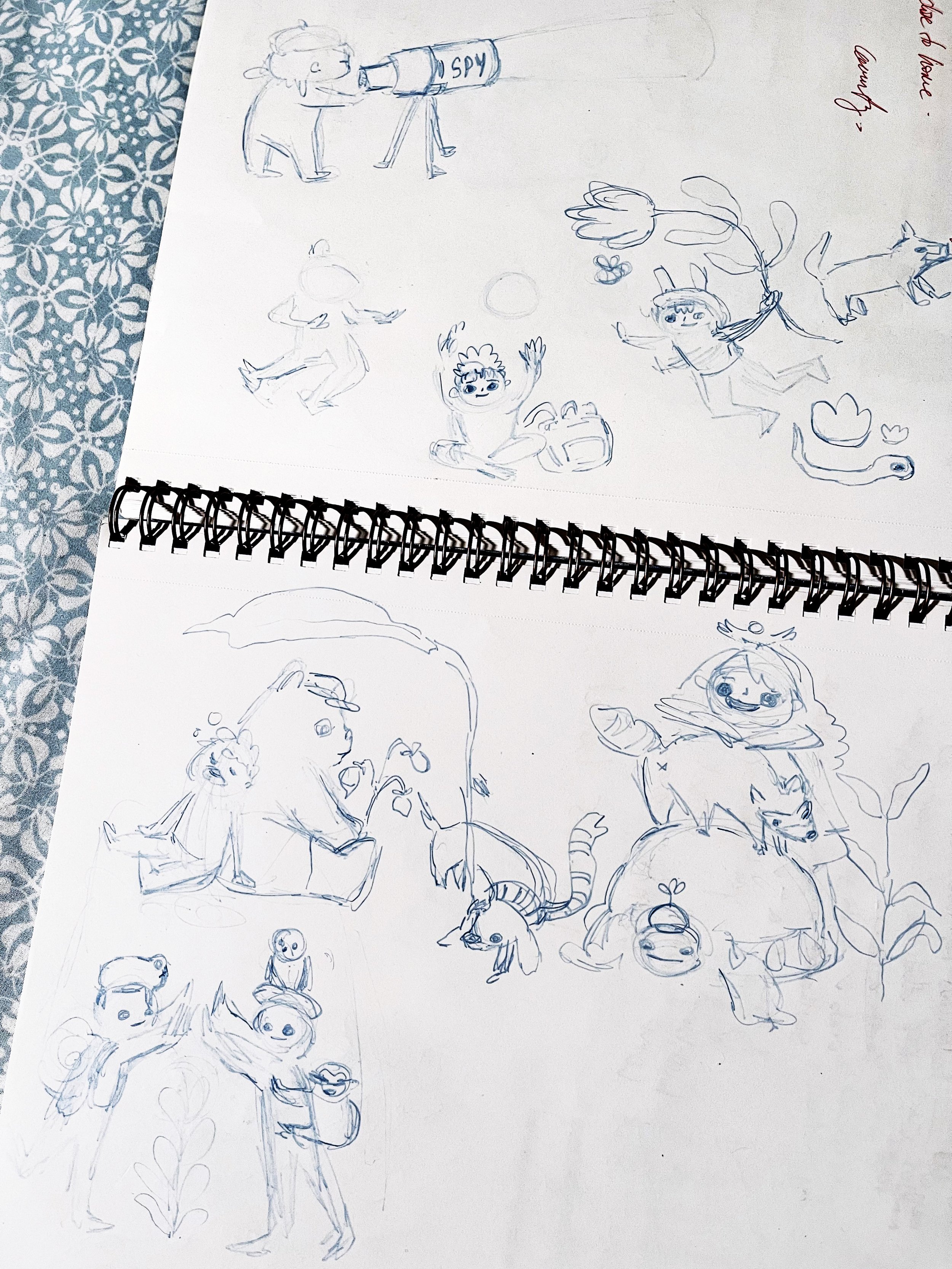
The brief was open ended, which is great, but also leaves me with too many options! I ended up with these sketches during a late-night brainstorm. Just working through what sort of shapes I wanted for the bodies and how I could stack floating elements since we were keeping the original walls visible.
Top right you can see me fitting things together like a loose puzzle. Bottom right I have a more literal stack of bird-human-raccoon-turtle. 🐤-👧-🦝-🐢
You’ll see in the end product that I did use most of these sketches minus the terrifying black holes for eyes. It was the trio of bear, sleeping child and sausage dog that sealed the deal for me. I ended up building the largest composition around this grouping. With a direction decided, I moved onto drawing digitally and putting together a proposal package for the client.
MAC, CAS and their DEI (diversity, equity and inclusion) team gave the green light after a few rounds of edits. Click through to see all the designs we settled on.

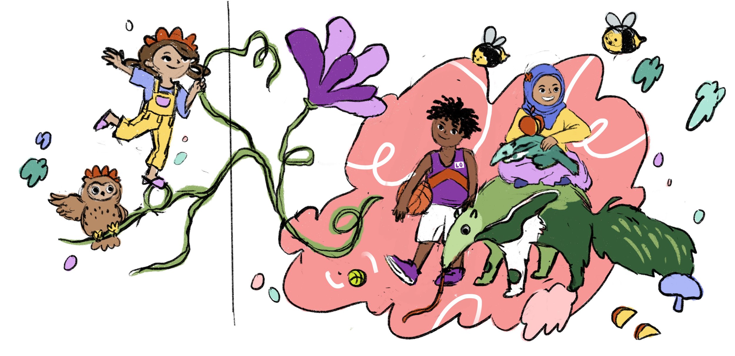
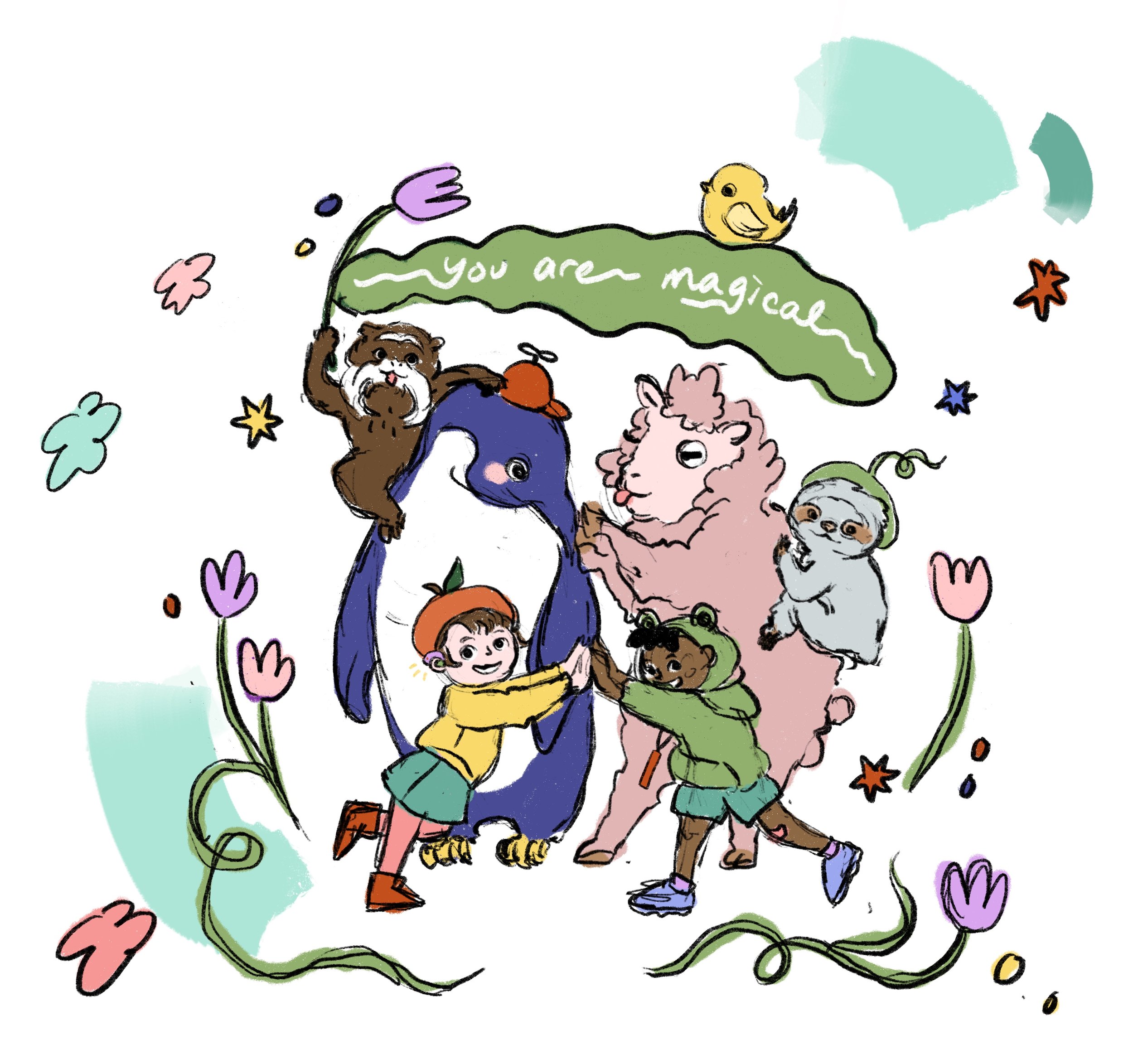

Can you spot where I incorporated my sketches into the design? There’s more but here’s a few items:
The trio with the bear is centered in the long composition
The stack is the last image in the carousel
Child with giant flower is on the right hand side of the long composition
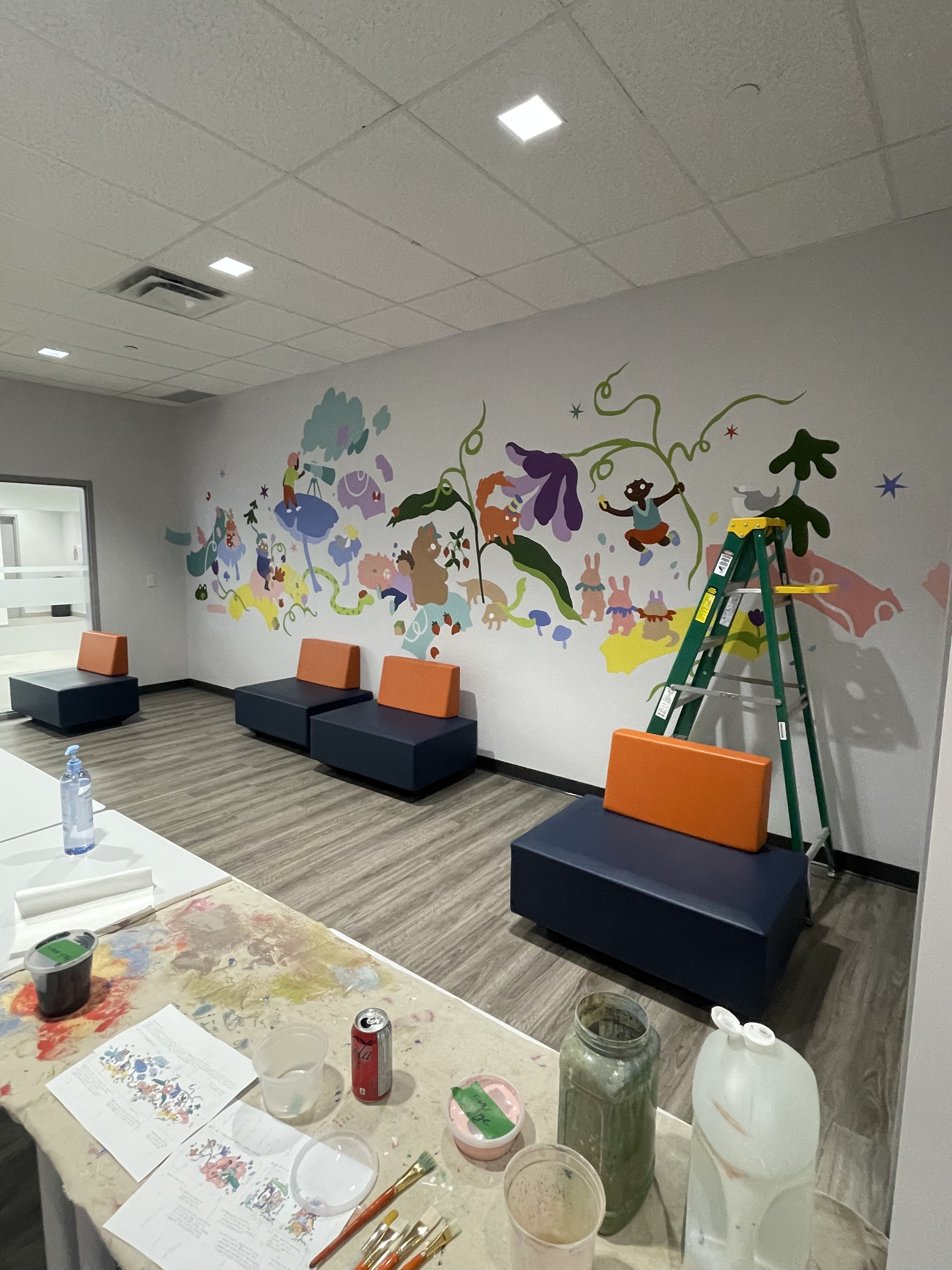
I forgot to mention, I had three walls in this room. (1) A very long white wall, (2) a smaller white wall with an even smaller wall to its left and (3) a purple wall split into two sections on either side of a tv.
Some things I thought about while designing:
Molding the design on wall 1 to fit around four sofas, but not so much that it would look weird if they were moved around the room
Using the existing purple on other walls to unify the design with the existing space
Play with stacking or repeating elements
Diverse and inclusive representation. This is something I already consider in my works especially since I create art for the public, but it was especially emphasized by the client so it took a few tries to reach something we both agreed on
Using the negative space
Choosing a colour palette. While I wanted it to be super colourful, I also have to think about the budget and not buy an absurd amount. I picked my staple colours, and a few others to complement. I thought about what colours I could mix and what I had to buy.
I picked up the paints, packed all my supplies and off we go ~
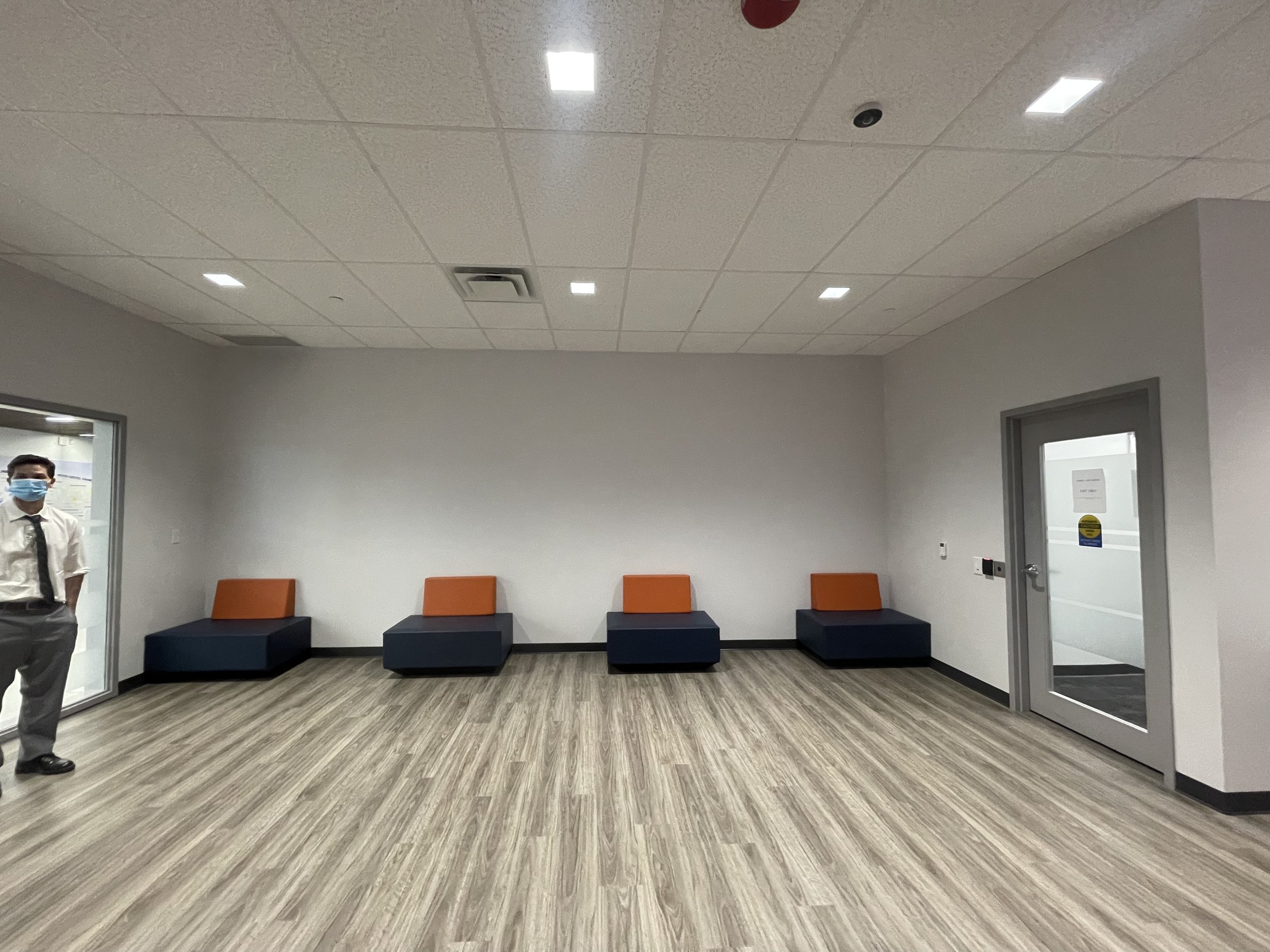
Here are the before pics of the room:

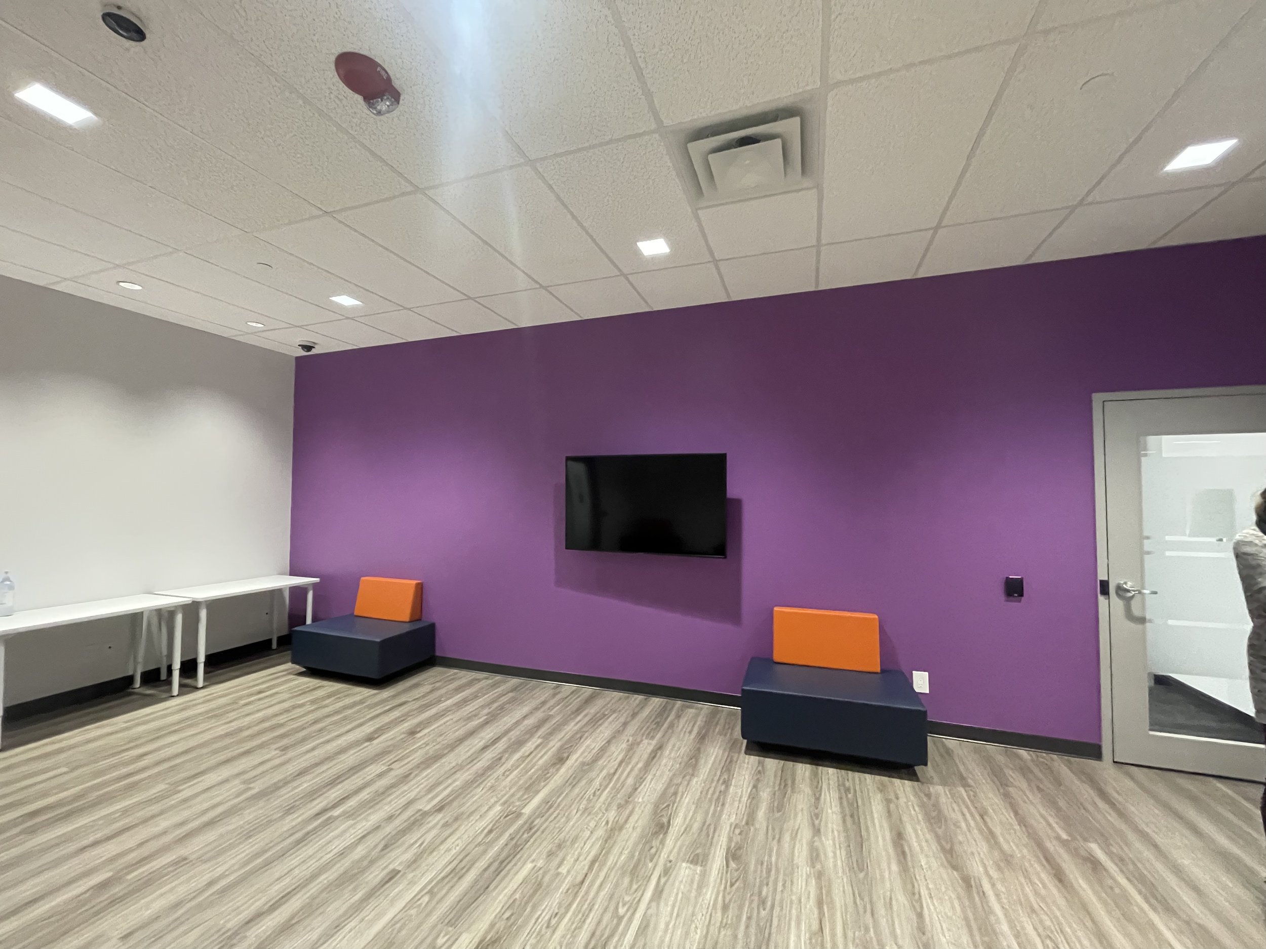
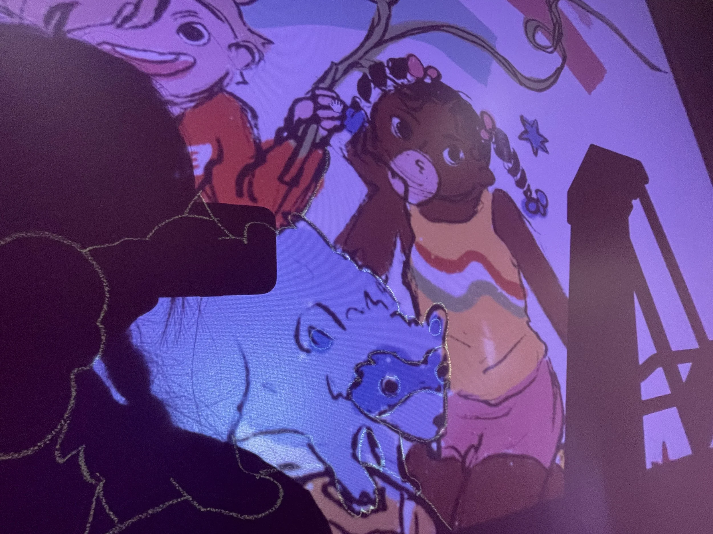
This is a rare indoor mural for me so hooray! I can use Optimus, my new projector buddy to help me out. I usually freehand the sketch, it feels and looks more natural to me. My lines are all very organic and I use a lot of floral imagery so it works out. A grid won’t be necessary until I have to scale things up even more (fingers crossed for even bigger walls in the future!)
With Optimus, transferring the design was a breeze. The image got warped a little bit here and there but it wasn’t anything I couldn’t adjust manually. I used chalk to draw the outlines. Smaller details like facial features and fingers were left out for now.
Here’s a closer look at what I see when tracing the projection. I cleaned up the lines as I went along since the sketch is pretty rough in some places. Somehow I didn’t think about my own shadow blocking the image, haha.


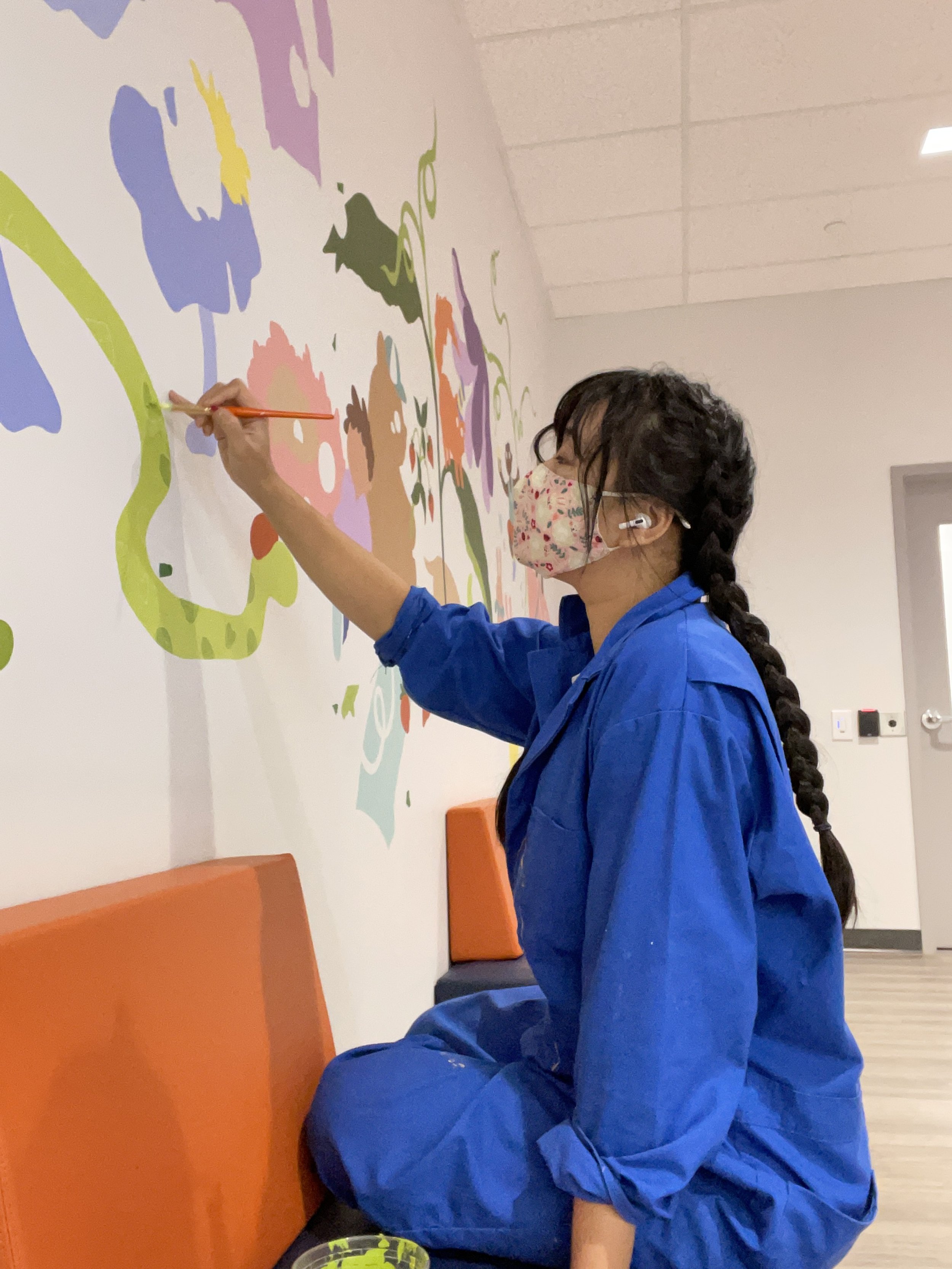
Once the chalk lines were done, Optimus went home and now I just had to paint like it’s a giant paint-by-number page. For the most part I went one colour at a time, and filled in things from back to front. Background shapes and bodies before eyes and small stars. I also mixed new colours as I went, mixing larger batches before colours I needed for smaller areas. I also paint back to front and big to small so that I can get used to materials. Wall surface and paint can change with each project so it takes a little getting used to. As I get familiar and warm up, I can execute more detailed things with more certainty.
In the photos the chalk is not visible on the white wall but it’s visible in person. I chose a pale green so I wouldn’t have to switch chalk for the white/purple walls.
As the walls slowly filled up my speed picked up. There was less paint mixing I had to do, I had to refer to the draft less, found my favourite tools for the job and my painting got faster and cleaner.
You can see in the painted shapes that I’ve left some negative space in the swirly lines. This I had to be very careful about because I didn’t have access to the original wall paint to fix it or even paint the negative space back in. If I messed up the lines I wouldn’t be able to re-do them.

There wasn’t a lot of texture/patterns to do but I went ahead and did that once most of the base was done. My least favourite part of murals is applying multiple coats of paint. I find it very boring, especially when painting white so I did that closer to the end of the project. Little detail items like stars and spots, they also get considered near the end. I try to pull existing colours from the mural for the small items to balance out the composition and use up any mixed paints I accumulated.
Once I filled in aaaall the colours and white, I reach a scary stage where the characters have empty white eyes ●︿● . I go back in with the chalk to draw in any details I need to do like patterns and all the outlines.
Black paint is left for the very last step. At this point I usually only have hair and the outlines left to do. I leave this for last because:
It’s very difficult to paint over black so I don’t want to paint a bunch of it only to realize later on that it needs fixing
I can adjust the shape of things slightly when I do the lines so I want to do this all at once with everything I need to consider filled in
Once all the paint has dried down, I can decide if the colours are contrasting enough as is. Do I need a black outline on everything? Maybe not. Too many lines can look cluttered and too uniform
Procrastination. The most nerve-wrecking part of the mural is the lines! :>
I’ve been trying to improve the linework in my murals because I think it’s too stiff sometimes. It is more successful when lines look more organic and the line width varies more, similar to the energy a sketch has. This is a work in progress!
My view from on top of the ladder :) You can see my labelled pots of paint on the right hand side, and another mural in the CAS building just outside the window
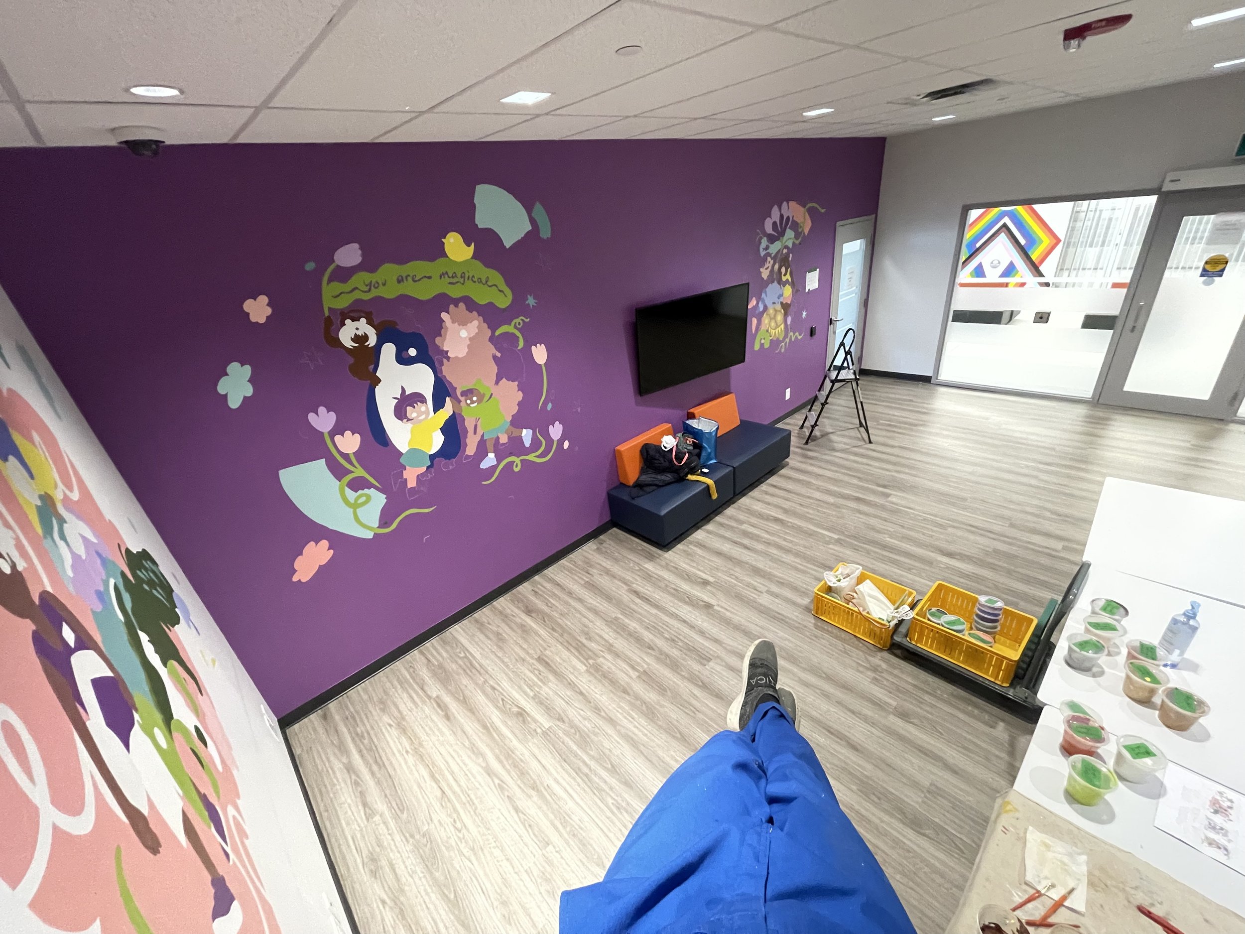
A look at my paint station. You can see a bit of my small clean-up station and my digital sketches with notes on the corresponding paint colours to refer to.
A little more here and there aaaaand we’re done!! 🥳😍 This is my celebratory pic on the last day of painting. Documentation pics coming up and I’ll highlight some features in the mural for you

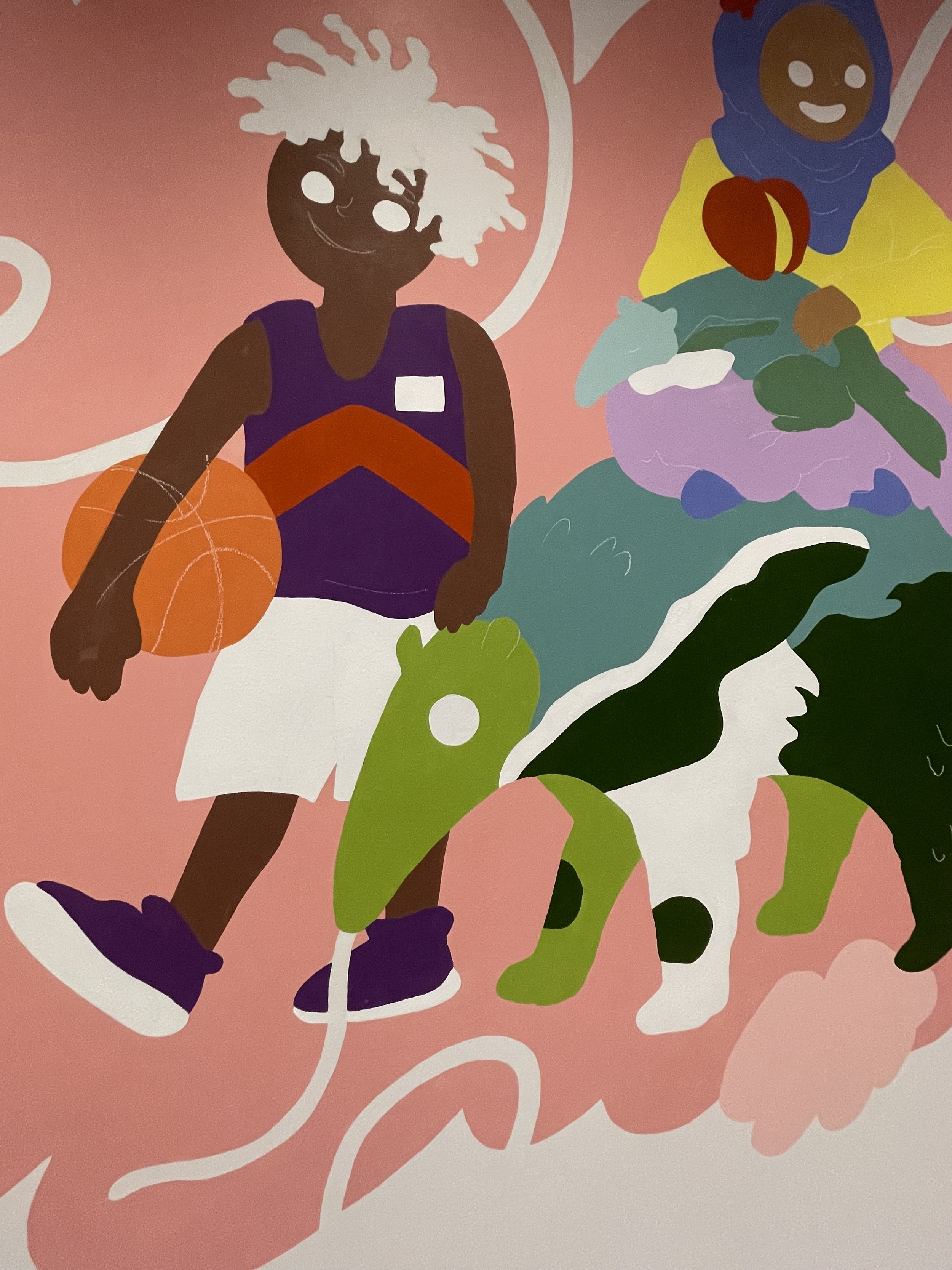
As I mentioned before, diverse and inclusive representation was very important for this space. However, it is undeniable that I cannot represent everyone in this mural, and different races, cultures and identities manifest very differently in obvious, subtle or imperceptible ways. I wanted to be thoughtful in the way I approached this, and I didn’t want it to come across forced. It was important to me personally that it felt natural. I won’t write a whole essay about everything I included in the mural (both relating to representation and otherwise) but here are a few highlights.
In the section pictured below, I intentionally have the owl and the child on the left mimicking each other. This was also done in my mural for High Park Zoo.
The child with the basketball wears clothes with the 90s Raptors colours. It brings in more of the purple colour from one of the walls and fashion from the 90s which is back in style with today’s youth. Note that they have a badge that says “L O.”
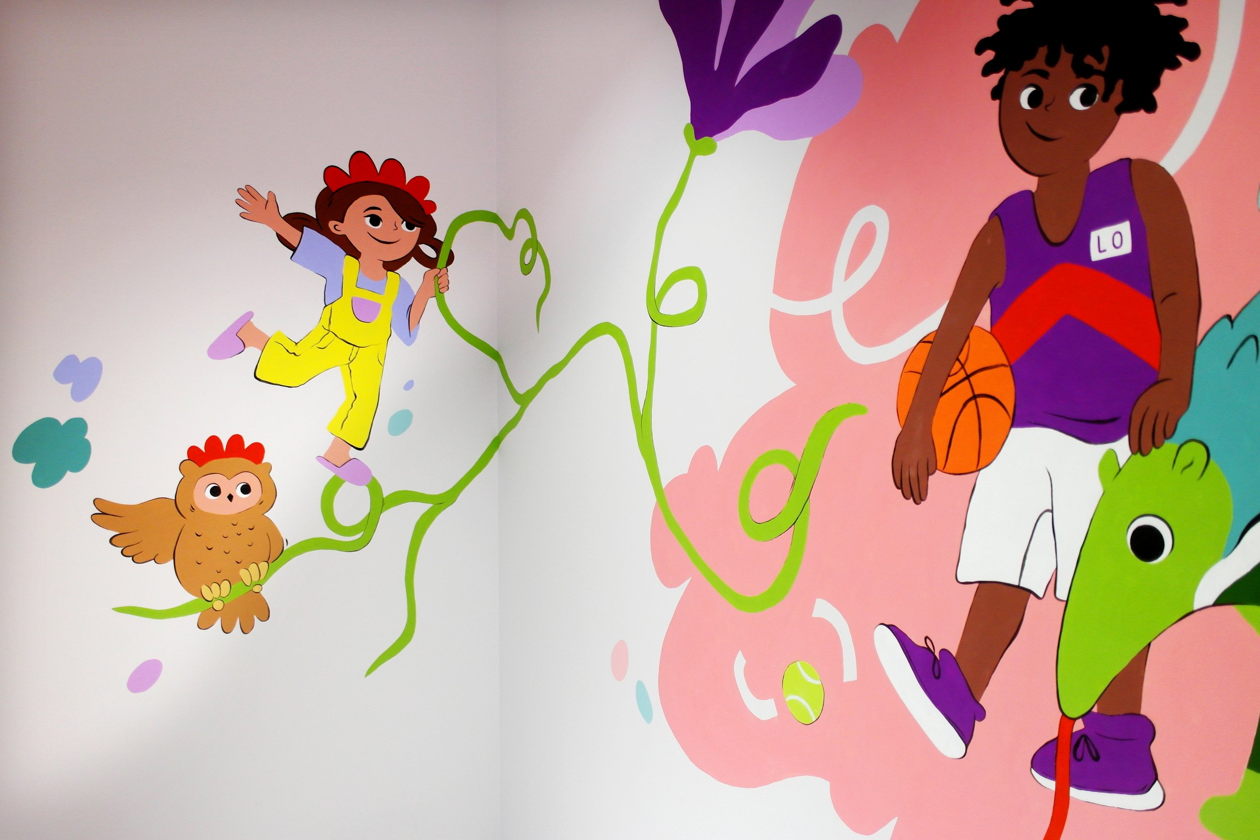
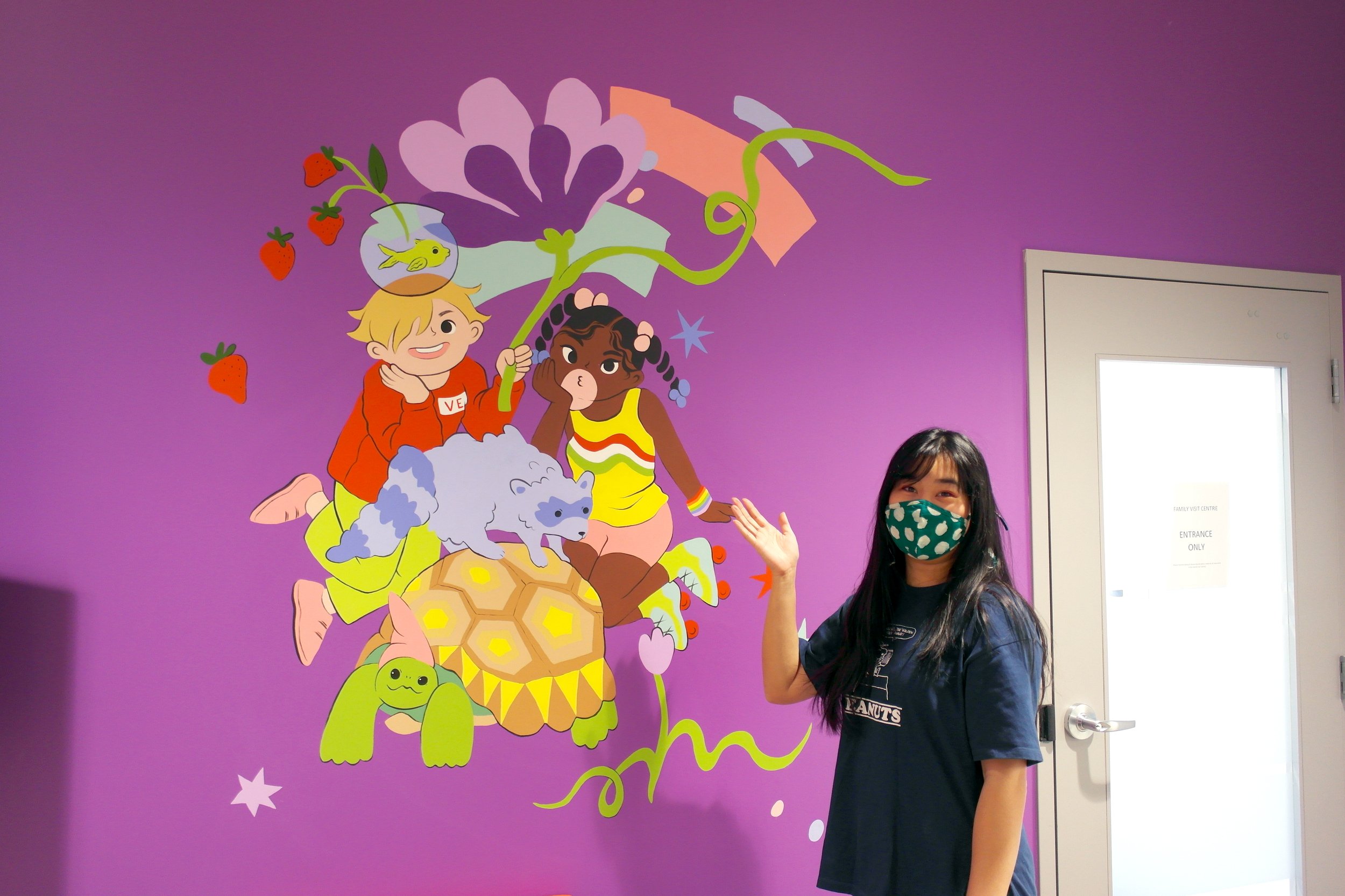
Here, the character in red wears a badge that says “V E,” to complete “L O V E.” This I also did in a mural for the Guardian Pharmacy. Along with the 6 colour rainbow wristband on the character on the right, this is a nod to the 2SLGBTQ+ community and a way to create connections between different characters and different walls.
This character with an orange shirt that reads “Every Child Matters.” National Day for Truth and Reconciliation (previously Orange Shirt Day) recognizes and raises awareness of the history of residential schools in Canada and honours the experiences of Indigenous peoples.

The trio of animal friends on the bottom right has a big bunny, a medium bunny, and a chipmunk pretending to be a bunny in a purple hat. This is another playful moment of mimicry.
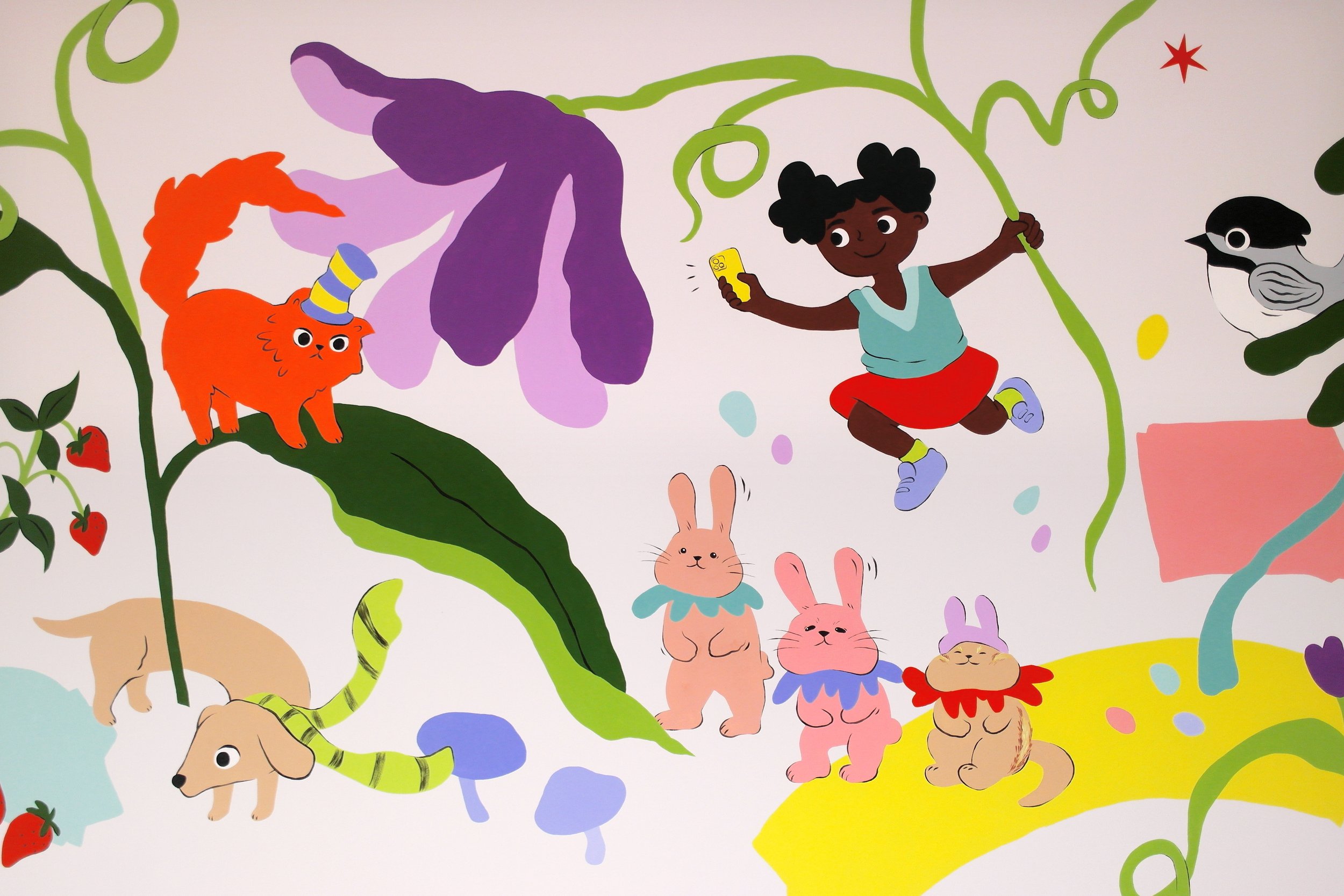
These two friends here are paired. The one on the left wears a hearing aid, and the one on the right wears a lanyard with a stick. It is meant to be an FM system which is a special wireless device that transmits audio to the hearing aid. I chose to include this because it is something I learned about while teaching workshops to kids.

I could write a whole lot more about all the references, but this post is getting very very long 😅 I’ll say that there are some fun references to internet/game culture for the kiddies too. If you can spot anything else and would like to share with me, I would be very happy to hear about it!!


I am very happy with how this project turned out. It was nice to paint indoors, I had the chance to take things slow and add more detail than usual. I really hope that it brings some joy into the space for the families that visit CAS!
You’ve made it to the end of this post!! I hope that this was interesting 😛 I'm still feeling out this blog thing, so if you have any thoughts for me about how this felt please let me know (ノ´∀`)ノ* *
The project page for the Playroom with more pictures and the official blurb can be seen here
I’ll share video clips/reels and some more pictures on my instagram
Thanks so much for reading! (ღ✪v✪)
🐣🐤 Linh